Film
Design
Head Graphic Designer: Peace in Drowning
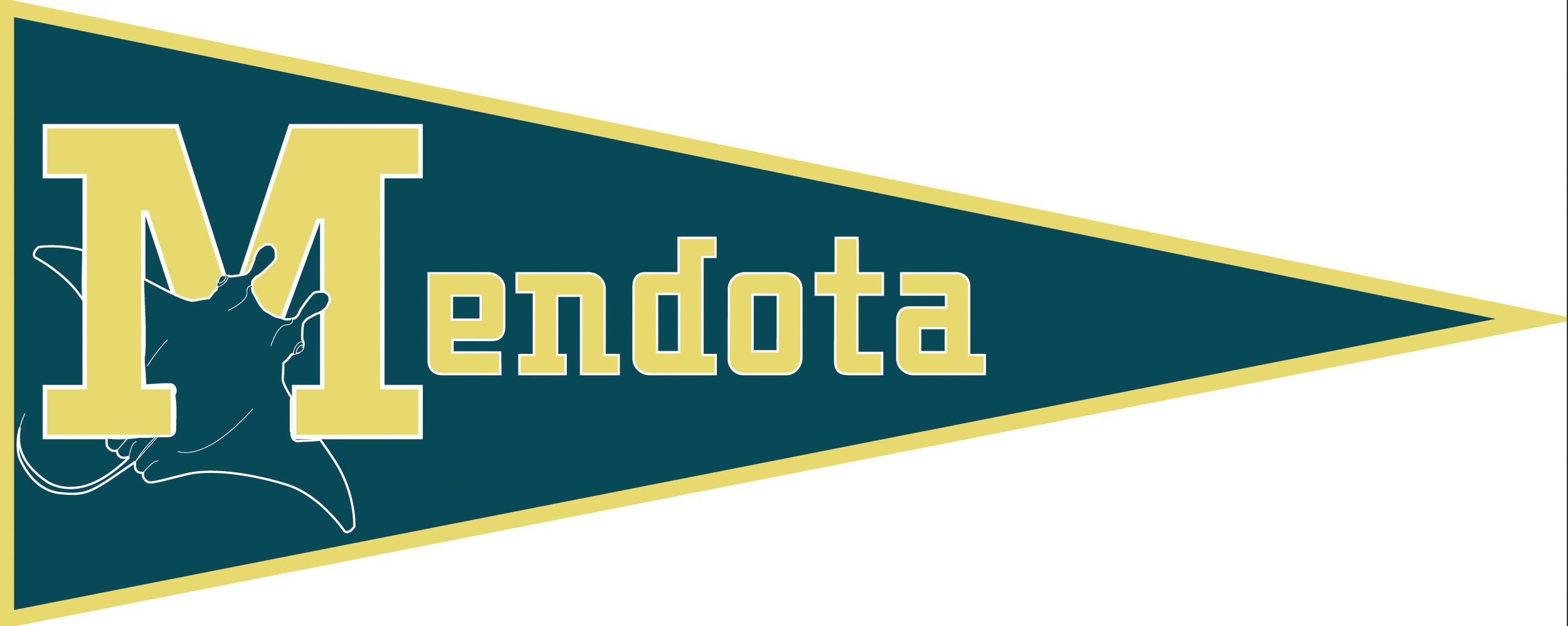
In October of 2022, I was approached by Elliott Dynes the director of the short film Peace in Drowning to be the head graphic designer. He was in need of a mascot design, as well as a set color scheme for the story which was about a water polo team. After researching I came up with the idea of utilizing the image of a stingray. I choose the stingray because they represent maneuverability, long journeys, and peace. These symbols are closely represented. the film as well, making it a perfect fit. For this project, I created stickers, posters, a 2x9 foot banner, as well as a pennant. For the typeface, I chose a typeface that closely resembled the one used for universities. The one decided upon was Kegger in regular.
The final pieces were created in Adobe Illustrator, then printed on a wax-based printer to give added shine to the piece. This project gave me creative freedom while also keeping to the guidelines of the film’s needs. I also learned to work alongside a printer closely, as well as with clients, and with pre-determined dimensions without being able to see the area before. The work was then displayed throughout the film.


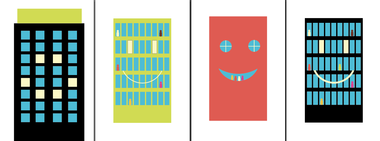
Head Graphic Designer: Apologize Later
After my work on Peace in Drowning In December of 2022, I was approached by Sofia Finnley, a director and art director of a sitcom called Apologize Later. For this sitcom, I was asked to create a mascot of a building with a smiling face on the front. I decided to take a more cartoon-stylized route rather than I had for Peace and Drowning. I then created a 2x4 foot-sized poster for the shoot. For this project, I had to work in a short time demand, as well as work alongside the printer to get the piece perfect. This was also created in Adobe Illustrator.